

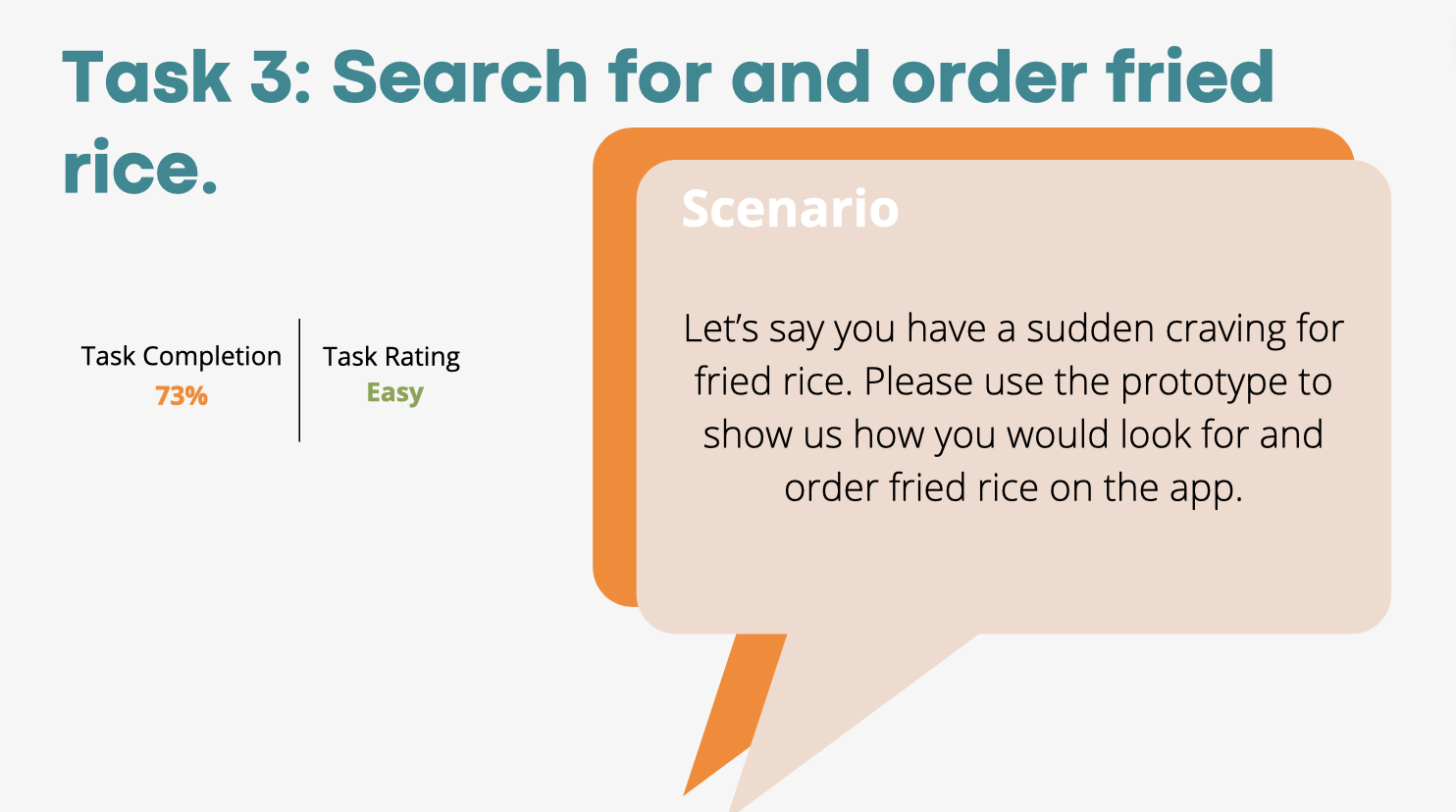
UX Research: FastFood App
Summary.
For our usability class, we were given a prototype to do heuristic evaluations and usability testing on. We then made a report with the insights gained from of our findings and actionable recommendations.
This
Role: UX Researcher
Team: Mia Spencer, Talia Potochny, Karan Karad, Saahari Kumar
Methods/Skills: heuristic evaluation, competitive analysis, flow/task creation, usability testing, script writing, interviewing
Scope: January - May 2022
Goal: Do usability testing and create a UX research report on the prototype provided to us.
My Contribution
We each did a full heuristic evaluation on the prototype. Then we chose three to flesh out and include in our presentation. I fleshed out “error prevention”. For our comparative analysis, I completed an analysis of “indirect competitors”.
Based off of a script given to us by our professor, I wrote the script so it made sense for us and our tasks. We each then found one participant and completed a usability test. We then put all of our notes into a spreadsheet.
I calculated the SUS score and created the slides with findings and recommendations for tasks 4 and 5.

This
The Prototype.
Heuristic Evaluation.
We used Nielsen's ten heuristics to do an initial evaluation of the prototype we were given. We discovered violations of 7 out of the 10 heuristics. We did an in depth analysis of three of them (class project requirement).
This
Below is an example of my analysis of violations of #5: error prevention:


Comparative Analysis.
We then did a comparative analysis of both direct and indirect competitors. (I completed the analysis of indirect competitors, show below).
This


Recommendations based on the comparatitive analysis…
Creating a website in addition to the app for Fast Food
All of our competitors also had a website in addition to their apps to order food.
Sort by cheapest delivery fees for different restaurants listed
People got frustrated with vague or changing delivery fees, so by having an option to sort by cheapest ones, we allow users to choose restaurants/locations offering less expensive delivery fees.
Sort by fastest delivery times/preparation times
A lot of the user feedback involved wanting the ability to order something quick.
Create an option for group ordering and payment to set our app apart
No other competitors we analyzed have an option to pay individually.
Options to modify/customize food options
Standardized way of modifying foods to fit into dietary restrictions or allergies
Customer service
Need to make it clear on our interface how to get help for cancelled/wrong orders
Script.
On the right is a sample of the script for our usability testing interviews.
This

Participants & Interviews.
Time was limited so each person in the group recruited and completed usability testing with one participant.
This


Notes & Spreadsheet.
We input all of our notes from our interviews into one spreadsheet.
This


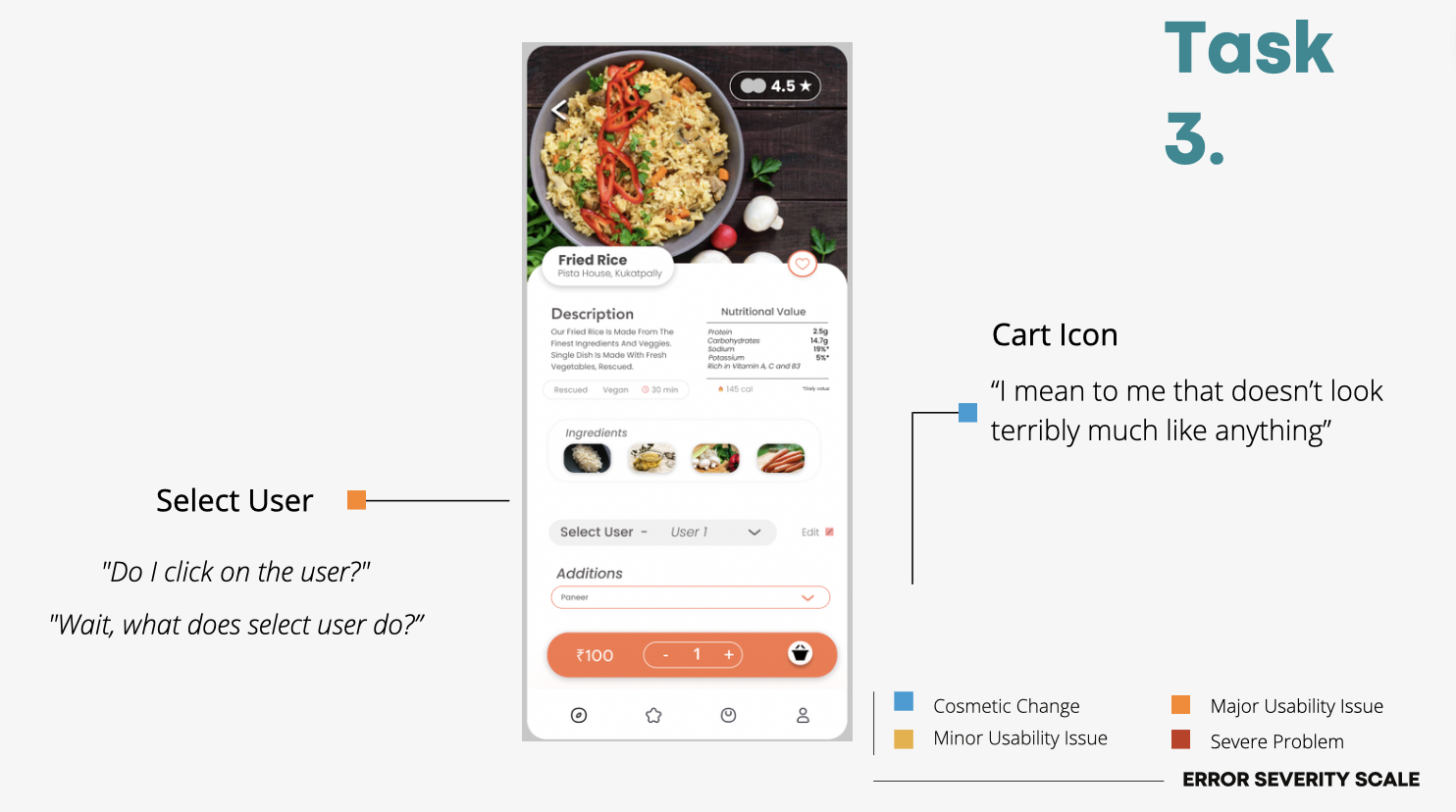
Findings & Recommendations (of Task 3).
We did an analysis and created recommendations for each task flow. This is the analysis for task 3.
This


This
Overall Quantitative Measures.


Overall Findings & Recommendations.
Confusing Features
participants did not understand and wanted instructions/walkthroughs for group ordering and user profile features
Counterintuitive Icons
users showed some confusion regarding the meaning of icons throughout the app
Security & Privacy: lack of information about protection
users concerned about using “locate me” as well as how their payment information would be protected if used in another app
Room for Improvement
users found most tasks relatively easy to perform and found the interface similar to delivery apps (and apps in general) they had used before
however, the SUS score was only 69.5 (68 being the minimum acceptable score), which leaves a lot of room for improvement
This
Reflections.
What I learned
Had some technical difficulties during the usability testing, learned how to handle them and talk about them in the usability report
How to work with group members who had differing levels of engagement with the project
importance of communication
What could be improved
No one in our group had made prototype flows before so there wasn’t much discussion about what each flow needed to include, where it should start/end, type of interactions, etc
Learned how detail oriented you have to be when creating flows
Before usability testing, we didn’t spend much time making sure there are no errors in flows and everything runs how it is intended to
This